One of the few things everyone can (probably) agree on is that colors are awesome. They breathe life into everything they touch and stir up all kinds of emotions. For companies looking to create or update their logo, the color(s) that the logo will ultimately contain is a crucial component of a successful branding strategy. Choosing which color(s) best suits your business depends on many factors and should be something that a lot of thought goes into. We’ve all seen brand logos that have made us cringe, a quick Google search will bring up some pretty… less than desirable designs. Surely those companies did not plan to create something unattractive, but it happened, and most likely because not enough time and consideration went into the creation or rebranding of the logo.
Because colors heavily influence a company’s first impression, it’s really important to choose the ones that best represent your organization’s personality. Take McDonald’s, we cannot think of that company without seeing red and yellow in our mind. What if they decided to change to blue and purple and flip the famous “M” upside down? Riots would ensue, governments would collapse and society would cease to exist. Okay, that’s a bit excessive but it would definitely cause a lot of upset. We cannot stress how important (and fun) the process of choosing your logo colors is but it needs to be emotionally strategic. In our previous post, we talked about the importance shapes have within logo design. Now let’s take a look below and see what each color on the spectrum represents and why it’s crucial to choose wisely.
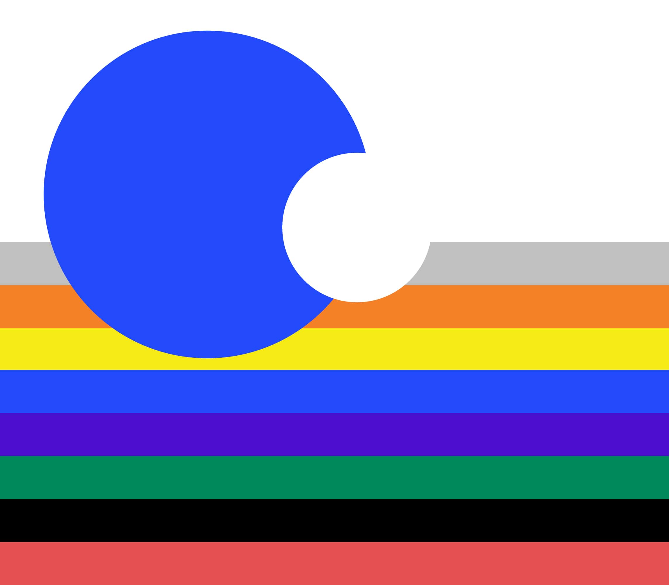
Colors
Think of your brand as a person. What kind of person they would be? Assertive and confident? Mellow and intelligent? Energetic and loud? There are specific colors to match those traits! The key is to know your brand well and how you want to present it out in the world.
Yellow

This festive color is all about the bright side of things, positivity, productivity, and energy. Because yellow catches the eye so quickly, it can also be used to signify caution. Its versatility and vibrance help a great deal in terms of standing out among the rest.

Orange

Using orange always makes a statement. It is the color of enthusiasm, harvest, understanding, and playfulness. It’s unapologetically confident, creative, and boosts mental activity. Brands that use the color orange have a very firm grasp on their brand personality.

Red

Red is the color of extroversion, love, warmth, youth, allure, and has been shown to get the heart pumping faster. It is another attention-grabbing color that represents passion, excitement, and urgency. That is why many times, things that need immediate action (i.e. traffic signs and sales) are typically in this color. Many companies use red to break through the noise and make a strong impression on their audience.

Blue

Many times, the natural world influences what feeling we associate with colors. Blue is one of the best examples of this. Our blue sky and oceans evoke feelings of calm and tranquility when we stop to look at them. Blue represents balance, intelligence, and sincerity. It is used by companies who want to communicate steadfastness, dependability, trustworthiness, and security. It is one of the more commonly used colors and with good reason.

Purple

Purple symbolizes royalty, luxury, spirituality, power, mysticism, wisdom, creativity, and going beyond the horizon. It’s great for brands that want to position themselves as sophisticated and thinking outside the box.

Green

Green symbolizes growth, health, peace, serenity, vitality, harmony, and of course, nature. Many companies who use this color tend to operate in either environmental or health spaces, but this is not always the case. Green is a healing color that contains soothing qualities. It can also represent wealth and ambition, which is why we associate money with this color.

Black

Although it is the absence of color, we will talk about black because it is so often used as a logo color. Black is associated with timelessness, sophistication, power, prestige, mystery, and professionalism. It is important to use this color wisely as it can sometimes be perceived negatively.

White

White is the combination of all colors and is part of a growing trend of simple logo designs. It represents purity, guidance, cleanliness, new beginnings, and hope.

Gray

Gray represents neutrality, stability, maturity, and authority. It is a great color because it matches well with many other colors and brings an element of professionalism and class to the table.

Take Your Time
Remember, it’s not just about the color being used, but also the hue! Using a certain hue of a color can completely change what personality your audience associates your brand with. Be sure to play around with a variety of options before making your final choice and take your time.
At WePropagate, we understand the power and importance of colors and love working with them. If you’re looking to find the perfect color(s) to fit your brand, you know what to do! Contact us to get started on this fun and vital part of the logo creation process.