Creating a logo is a really fun part of the branding process, it is the point at which you get to be creative in deciding how your company presents itself. This of course takes a lot of hard work and a surprising amount of emotional intelligence to do correctly. Think about your favorite company, odds are that you love their logo, right? A lot of time and effort has gone into creating that particular logo’s ability to generate a positive reaction from you.
When it comes to logo design, every little detail involved is deliberate. Knowing your company’s “personality” as well as your target audience are key to creating a logo that resonates well with current and potential clients for (hopefully) years to come.
In this article, we’ll take a look at the importance that shapes have in the logo creation process.
The Meaning Behind Shapes
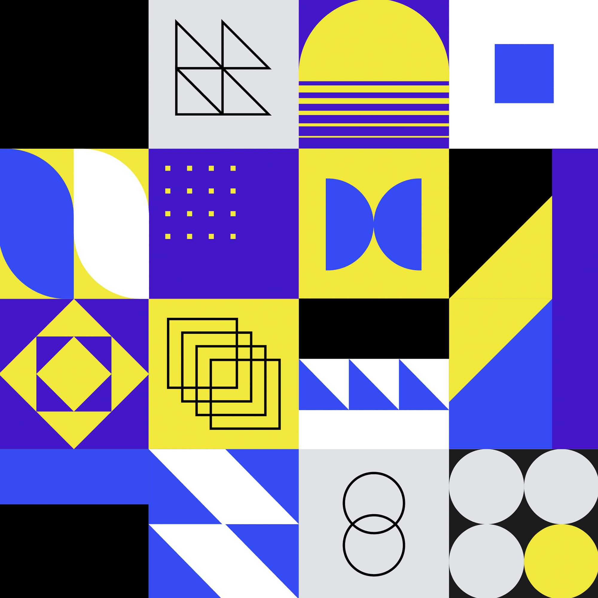
The shape a logo has creates a subconscious reaction within each of us. Depending on what your company sells and represents, you will want to carefully consider what shape your logo will use. It’s also important to think about how the shape will look on different materials and digital platforms as well!
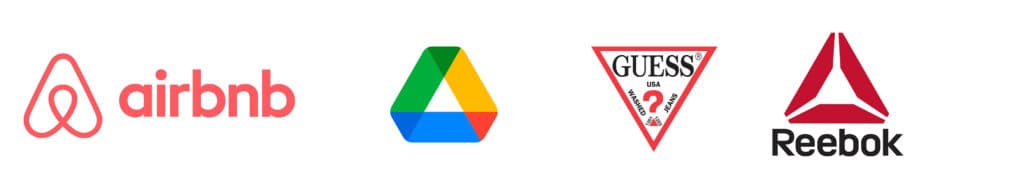
Circles
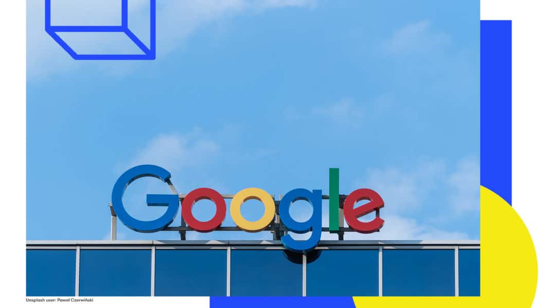
A classic and easily recognizable shape, circles represent collaboration, positivity, human connections, relationships, and because they have no beginning or end, infinity. Think about wedding rings. When people get married, they use rings to signify endless love and support for each other. Shapes with rounded edges tend to be associated with feminine characteristics. Circular logos are a great way to quickly grab someone’s attention.
Squares and Rectangles
Shapes with straight edges such as squares are associated with masculinity, balance, power, and practicality. The use of straight lines evokes a feeling of organization and stability. Using the square shape is a great option because we typically associate this shape with safety and security.
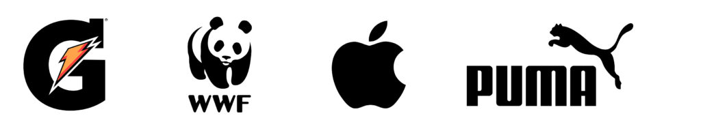
Triangles
Similar to squares, triangles are also associated with being balanced, powerful, energetic, and masculine. One great thing about this shape is that its symmetry is very attractive to the eye and achieves a nice balance between circular and square shapes. They can be inverted or used as text within the logo as well, so there is a lot to play around with.
Lines
Vertical lines are typically associated with masculinity, power, and a more aggressive approach in general.
Horizontal lines are seen as more feminine and calm, which can be a great offset to a masculine shape.

Remember, you can always mix and match! If you choose a circular logo but still want it to contain a good balance of feminine and masculine aspects, you can consider using vertical lines within it.
Organic
Logos with organic shapes use a design that was specifically created based on shapes in the naturally occurring world, as opposed to the above which draw from geometric shapes. This is typically used by companies that understand their brand identity very well and want to convey what their company stands for in a very direct way.
Since a logo is how a brand represents itself out in the world, it’s no surprise that choosing just the right combination takes time. At the end of the day, it all comes down to knowing your company and audience. If you can understand this and apply a little bit of emotional intelligence to what you choose, you’re already ahead of the game.
If you are looking for help in designing your logo, WePropagate’s creative design studio is here to help! We love getting to know brands and creating outstanding designs. Check out some of our work here and be sure to get in contact to discuss your project with us!