Typography directly affects a brand’s tone. Depending on the level of professionalism or fun you want to convey, there is a lot to play with when it comes to using fonts. Some, like Times New Roman and Helvetica (both of which trigger a sense of stability), have become staples within our daily lives without most of us even noticing.
Fonts can quickly cause a strong reaction or association from a reader. It’s amazing how much can be said visually. In our previous post, we discussed colors and their influence on a buyer’s perception of a company. Let’s now dive into the third and equally important component of successful logo design: fonts.
Fonts – What Personality “type” are you?
Check out the major type classifications and what they stand for to see which fits your company best.
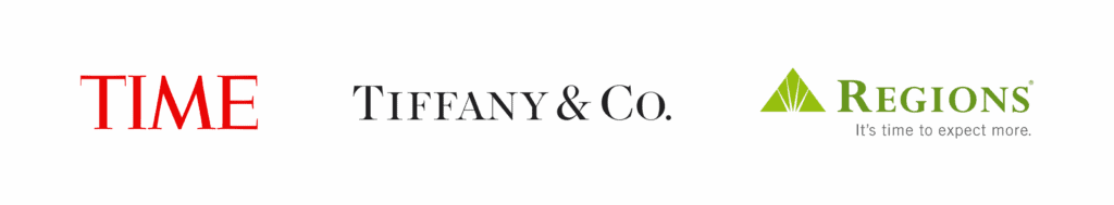
Serif
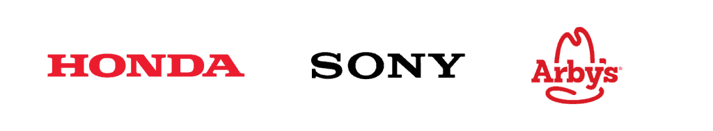
Serif is the oldest font type around. It was used by Romans while they were painting on parchment and has continued to be a favorite throughout the ages. It is a great option for companies looking to be perceived as classic, reliable, trustworthy, timeless, and full of heritage. What gives this font family a bit of character is the little “wing” at the bottom of the letters. Serif is also associated with being assertive, masculine, and powerful. It is among one of the most traditional directions that you can take.

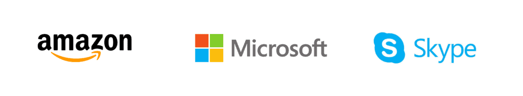
Sans Serif
Unlike serif, sans serif does not have the “wing” at the bottom of the letters. Think of it as a serif’s younger, more hip cousin. Because of its direct, clean, modern, and professional look, sans serif was deemed the go-to choice for online text. Sans serif isn’t filled with fluff, gets straight to the point, is very sensible and forward-thinking.

Slab serif
Slab serif is durable, solid and makes a statement. Companies who want to exude confidence and boldness should consider using these typefaces. Many times, when a new product hits the market, they use a slab serif to make an unforgettable impact on their audience.

Script
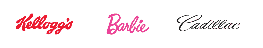
Script, derived from a handwritten look, is probably the most personal from this entire list. It’s great for brands looking to differentiate themselves, show off their creative side, and give an air of elegance. It is also associated with being comforting, soft, and feminine. This font style is a lot of fun and produces some great results, but make sure that it is easy to read.

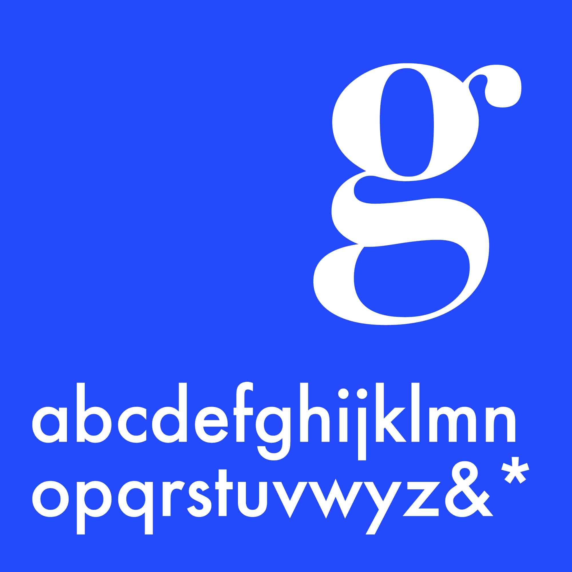
Modern
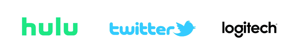
With modern fonts, simplicity is key. Letters can be thick or thin but the goal is always to be as legible as possible. Modern font portrays style, strength, progressivism, and intelligence. It is a great route to go if you wish to appeal to younger audiences.

Display and Decorative
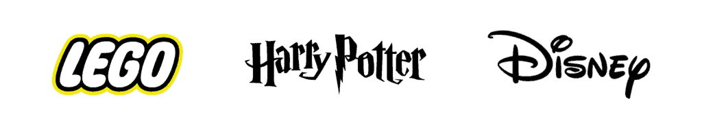
Definitely the most unique of the bunch, display and decorative fonts are highly personalized and typically customized. Depending on how they are styled, they tend to be friendly, welcoming, and fun. Since these are created to fit the needs of a company, they can also portray other traits such as being casual, amusing or expressive.

Pro tips
Font size matters too. Don’t go too big or small, size 12 tends to be the sweet spot but don’t limit yourself to a default number. Be sure to check out what your competitors are doing in terms of style and size and go from there.
No matter which font you choose, it MUST look clean on various types of printed and digital material. There is nothing worse than making a user strain their eyes to understand what they are reading. You’ll lose them.
Putting it all together
An important theory for designers to understand is the Gestalt theory. This is related to visual perception and how humans group different objects together to form a larger unified whole. What it is essentially saying is that in order to successfully convey a message, all parts within a design need to work together cohesively. That means shapes, color and font need to make complete sense. Imagine that Bank of America starts using Comic Sans. The brand would no longer be conveying professionalism and reliability, it would now be seen as silly and immature, resulting in a huge loss of clientele, all because of their font choice.
At WePropagate, we are driven by creativity and a love of all things art. Our goal is to elevate your business and help it stand out among the rest. If you are looking for branding services, we’d be more than happy to help! Contact us here.